How to Design a Room Around a Painting:
I love to use art as the focal point of a space, and I find that many of my clients come to me to purchase a large piece of art (or commission one) with the goal of building everything else around the artwork.
By selecting thoughtful design elements to complement the artwork, you can allow the artwork to truly shine.
What do I mean by using art as a “focal point?” Focal Point literally means the “center of interest or activity.” It’s where you want “the viewer” to look and to keep their eyes captivated. It’s where their eyes will always rest after scanning the rest of the space.
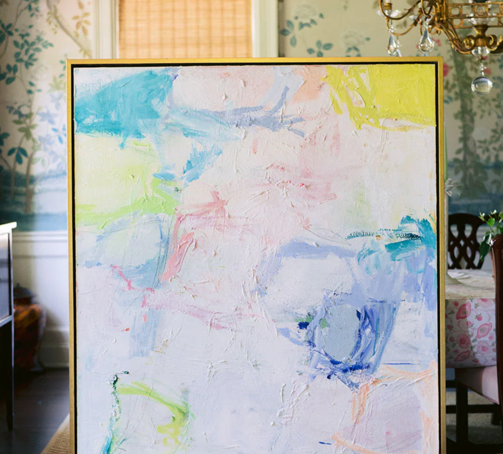
Lucky for me, I create pretty large, bold pieces of artwork, like the one pictured here, so people love building their designs around one of my pieces. In my experience, if you love a piece of art, there is ALWAYS a way to build your interiors around it.
Shop the furniture and decor pictured
Here are 3 ways to use art as the focal point of your design:
1) Direct Everything to the Focal Point:
This means that there should only be one major focal point in your space, in this case, the artwork. Everything else is secondary and complementary. You should not have any other large or competing pieces of art in the space, nor should there be furniture, fabric or accessories that steal the show, or take away from the focal point. For example, in this collage, I have included some light pink and aqua throw pillows by Sister Parrish. I love that the patterns are fun, yet dainty, and that the pillows are monochromatic. It allows for a pop of coordinating color without taking away from the multiple colors in the large piece of artwork.
2.) Select the Appropriate Wall for the Focal Point Artwork.
In design, there are rules to follow, but it’s okay to sometimes break the rules. So take this piece of advice with a grain of salt. However, in general, as you walk into a space from the front entrance (which is the main area all your guests will come through including yourself) you would hang your artwork on the first wall you see as you enter the room (first choice placement). Sometimes that won’t work because of a fireplace, low ceilings, moulding, etc. So if it doesn’t work, then simply ensure that scale is at play when deciding where to hang the piece. In general, bigger is better, but you don’t want the art to feel crowded either.
3.) Select Colors and Textures that Enhance the Artwork, Not Detract from it.
If the artwork is neutral and you’re going for a neutral look, you can use a variety of neutral tones and textures like rattan and wicker that create a sense of quiet beauty. If the art piece is colorful, you should pull 2-3 colors from the piece and use it on coordinating elements like pillows, upholstery, and drapery. Keep the mix of colors monochromatic or more subdued in nature so that you let the artwork speak for itself. The wall color should also not compete with the artwork. I’m all for layering art on top of wallpaper, but make sure the wallpaper isn’t so wild and patterned that it detracts from the piece.
Shop everything here (aside from the artwork!) via my Like to Know It
Looking for your own perfect statement piece of artwork? Contact me for a complimentary consultation, or learn more about the commission process here.


